主题
自定义组件
定义组件
在 json 文件中进行自定义组件声明:
json{ "component": true }在 js 文件中进行组件定义:
jsComponent({ // behaviors,类似于 mixins,用于复用组件的代码 behaviors: [], // 组件选项 options: { multipleSlots: true, // 启用多插槽支持 }, // 外部样式类,允许父组件修改样式 externalClasses: ['custom-class', 'title-class'], // props properties: { myProperty: { type: String, value: '', }, myProperty2: String, }, // 私有数据,可用于模板渲染 data: {}, // 侦听器 observers: { 'value, defaultValue, options': function (value, defaultValue, options) { const current = value !== undefined ? value : this.data.innerValue || defaultValue || (options[0] && options[0].value) this.setData({ innerValue: current }) this._updateLayout(current) }, }, // 组件级生命周期函数 lifetimes: { attached: function () {}, moved: function () {}, detached: function () {}, }, // 页面级生命周期函数 pageLifetimes: { show: function () {}, hide: function () {}, resize: function () {}, }, // 组件方法 methods: { onMyButtonTap: function () { this.setData({ // 更新属性和数据的方法与更新页面数据的方法类似 }) }, // 内部方法建议以下划线开头 _myPrivateMethod: function () { // 这里将 data.A[0].B 设为 'myPrivateData' this.setData({ 'A[0].B': 'myPrivateData', }) }, _propertyChange: function (newVal, oldVal) {}, }, })
组件样式
注意事项
- 在自定义的 wxss 文件中,不允许使用标签选择器、id 选择器、属性选择器。
- 默认情况下,全局样式、组件使用者(组件所在的页面样式)对自定义组件无效。
样式隔离
通常有 2 种方式定义:
json
{
  "component": true,
  "styleIsolation": "shared"
}
js
Component({
  options: {
    styleIsolation: 'isolate',
  },
})- isolate:开启样式隔离。在默认情况下,自定义组件和组件使用者如果存在相同类名,类名不会相互影响。
- apply-shared:表示组件使用者的 wxss 样式能够影响到自定义组件;但是自定义组件的样式不会影响到组件使用者的样式。
- shared:表示组件使用者的 wxss 样式能够影响到自定义组件;且自定义组件的样式也会影响到组件使用者的样式。且其他使用了 apply-shared 以及 shared 的自定义组件也会受到影响。
apply-shared:单向穿透
页面样式 -> 影响组件,组件样式 -> 不影响页面
场景举例:
- 在页面
.wxss写了view { color: red; },组件内的文字会变成红色。但是如果你在组件的.wxss里写了view { margin: 0; },它不会影响页面上的其他 view。
shared:双向穿透
页面样式 <-> 组件样式,完全互通
场景举例:
- 页面控组件:在页面
.wxss写了.internal-title { font-weight: bold; },组件内的标题会加粗。 - 组件控页面:在组件
.wxss写了view { background: #f5f5f5; },全页面所有的 view 背景都会变色。
props
js
Component({
  // 组件的属性列表
  properties: {
    foo: {
      type: String,
      value: 'foo',
    },
  },
})
html
<custom-component foo="foo"></custom-component>emit
html
<custom-component bind:customevent="handleCustomevent"></custom-component>js
Component({
  methods: {
    handleCustomevent() {
      this.triggerEvent('customevent', 'xxx')
    },
  },
})
observers
js
Component({
  properties: {
    label: 'foo'
  }
  data: {
    num: 0,
    count: 0,
    obj: { id: 1, name: 'foo' },
    arr: [1, 2, 3],
  },
  observers: {
    'num': function (newNum) {},
    'count': function (newCount) {},

    // 监听多个属性
    'num, count': function (newNum, newCount) {},

    // 监听对象属性
    'obj.name': function (newName) {},

    // 监听数组子项
    'arr[1]': function (newItem) {},

    // 通配符
    'obj.**': function (newObj) {
      // 此时 newObj 为对象
    },

    // 监听 props
    'label': function (newLabel) {
      // props 的监听器会立即触发
    }
  },
})
插槽
默认插槽
html
<custom-component>Hello World</custom-component>html
<view>
  <slot></slot>
</view>
启用多 slot 支持
默认情况下,一个组件的 wxml 中只能有一个 slot(默认插槽)。当需要多个 slot 时,需要启用 multipleSlots 选项:
js
Component({
  options: {
    multipleSlots: true,
  },
})
通过为 slot 添加 name 属性来区分不同插槽:
html
<custom-component>
  <view slot="header">header</view>
  <view>body</view>
  <view slot="footer">header</view>
</custom-component>
html
<slot name="header"></slot>
<slot></slot>
<slot name="footer"></slot>
获取组件实例
调用时需要传入一个匹配选择器 selector,如:this.selectComponent(".my-component")。
html
<custom-component id="the-id"></custom-component>js
Page({
  getChildComponent() {
    const child = this.selectComponent('#the-id')
    console.log(child)
  },
})
export 自定义的组件实例获取结果
若需要自定义 selectComponent 返回的数据,可使用内置 behavior: wx://component-export
js
Component({
  behaviors: ['wx://component-export'],
  export() {
    return {
      myField: 'myValue',
    }
  },
})
js
// <my-component id="the-id" />

// 父组件调用
const child = this.selectComponent('#the-id')
// ===> { myField: 'myValue' }
behavior 逻辑复用
js
const behavior = Behavior({
  // ...
})

export default behavior
js
import behavior from './behavior'

Component({
  behaviors: [behavior],
})
技巧
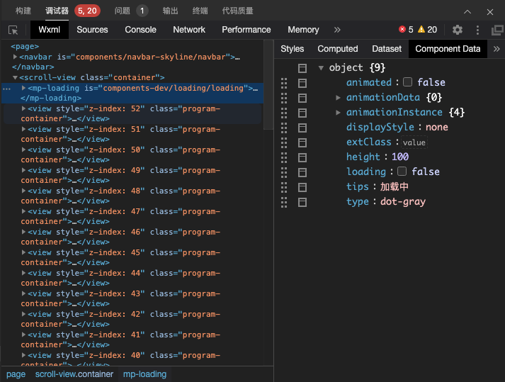
调试自定义组件
wxml 面板中可以查看自定义组件在渲染时的 Data 数据。 在 wxml 中先选中需要查看的自定义组件,然后切换到 Component Data 即可实时查看当前自定义组件的数据。
外部样式类
html
<custom-component extend-class="my-class"></custom-component>css
.my-class {
  color: red;
}
js
Component({
  externalClasses: ['extend-class'],
})
html
<view class="extend-class"></view>